

I work best when I am initiating action and not responding to it. Modern desktop and mobile operating systems feel like they are increasingly moving to the other extreme: reactive “command stations” that send updates your way and sculpt the pace and content of your thoughts. One manifestation of these are push notifications.
If you’ve read my .bash_profile and .ssh/config posts you’ll know I find much liberation in simplicity and austere minimalism.
Let’s find out how to do the same with macOS.
An empty mind is a happy mind!
Notifications
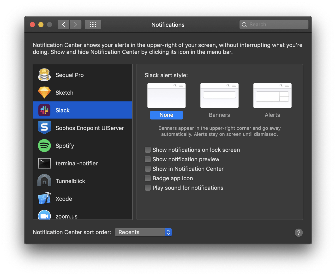
Just turn everything off. No banners, no alerts, no notifications, no badge app icons. Nothing. If everything is a priority, then nothing is a priority!
This has added utility if you often screen share in a professional context like I do. Nothing is worse than having a sensitive Slack message pop-up while someone else is looking at your screen. One time I Slacked my colleague, “Remember that time I saw Carrot Top at the airport?” and it appeared during his sales pitch.
Bartender

macOS offers no way to clean up or organize the contents of your menu bar. Bartender is a nice little utility that lets you conditionally hide icons as you see fit. Surprise: I keep most things hidden.
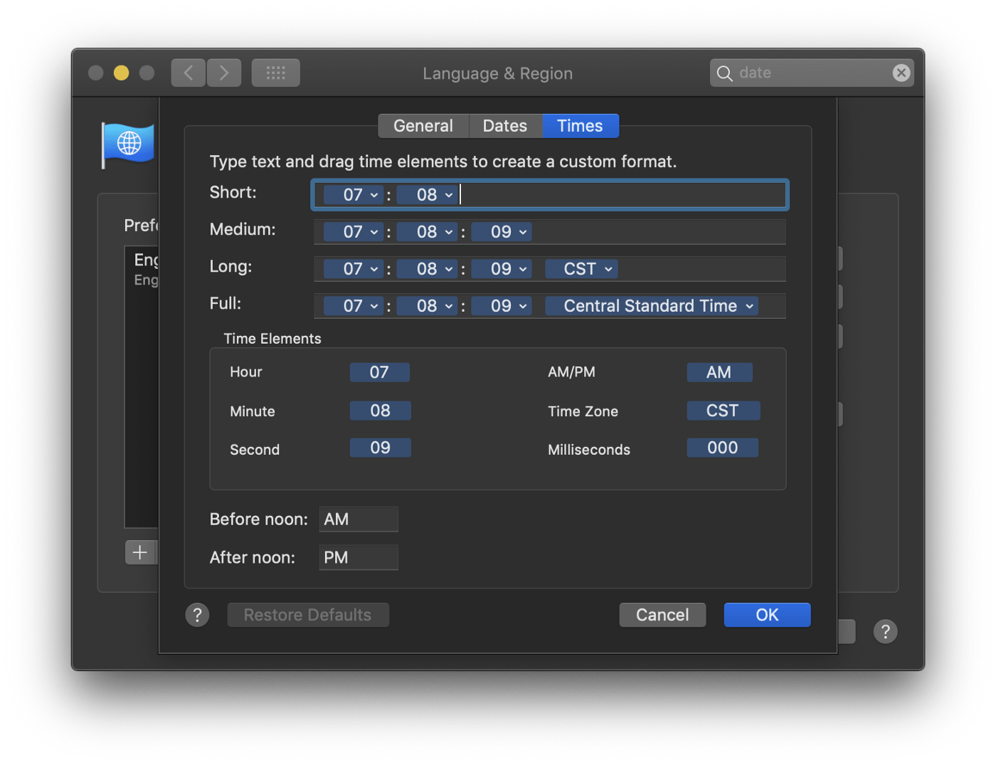
I switched to 24 hour time a few years ago and have never looked back. From this screenshot alone I know I took it in the morning.
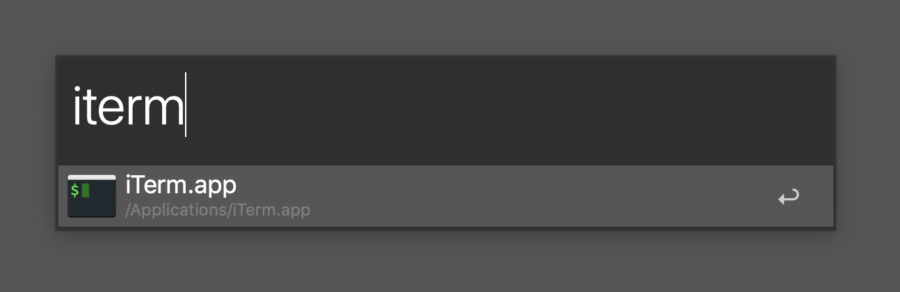
Alfred
Alfred is another utility that I am deeply thankful for. At any time, I can press ^+Spacebar and a text input appears. From here I can launch any program, start a search, trigger shell scripts, and view my clipboard history. It does a whole bunch of other stuff, too. I probably only use 5% of the features.
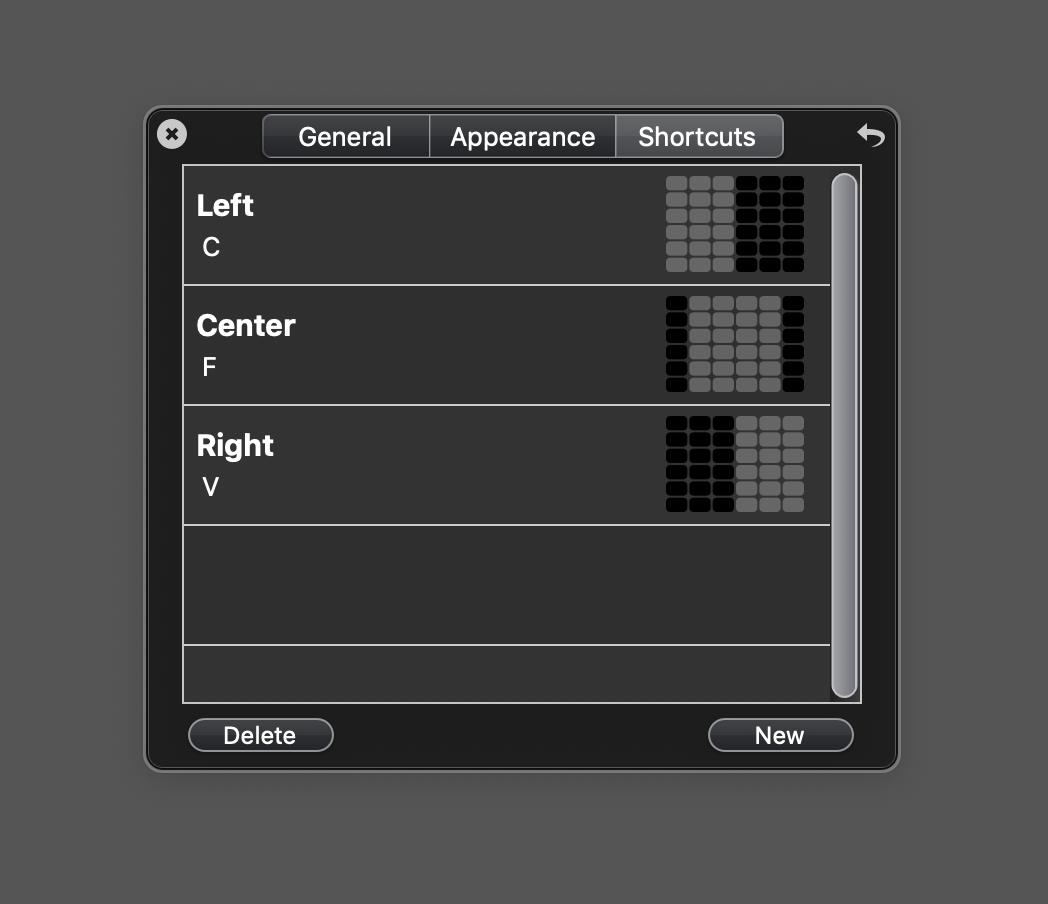
Divvy
Yet another utility I am deeply thankful for is Divvy. It is a simple window management tool that allows me to resize windows with simple keyboard combinations. I have this set to ⌥+Space.
Desktop & Finder
The Desktop Itself
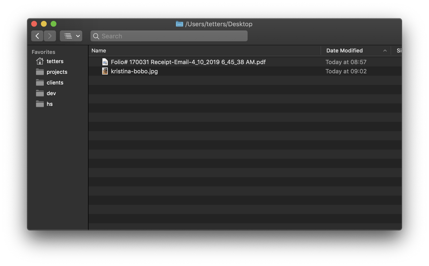
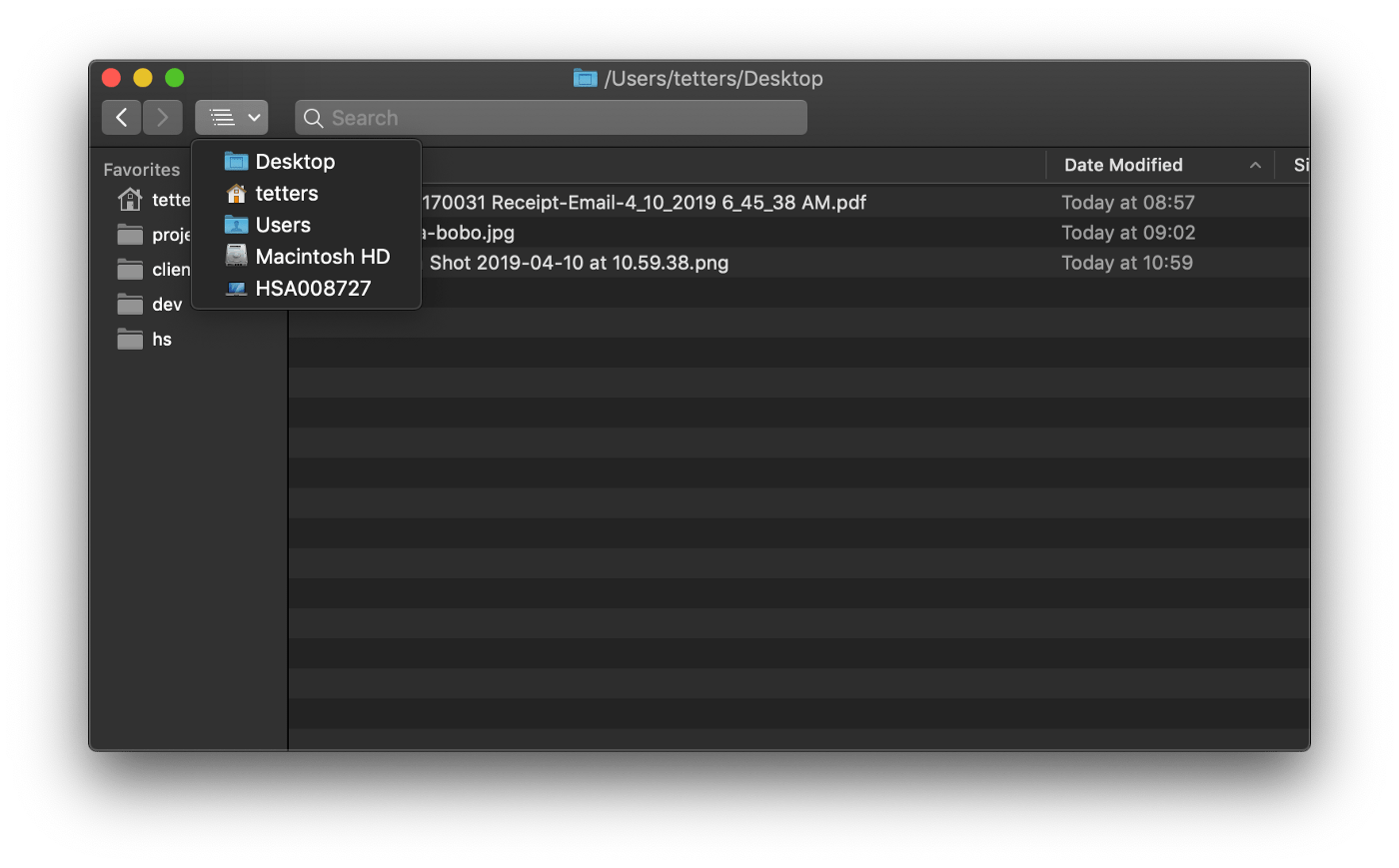
Files don’t linger on my desktop for more than a few hours. I have all my downloads set to land here. It is the temporary holding space for files I’m working with. In the above image, you can see I have a hotel receipt I need to enter as an expense report along with a photo from a new Highlander to add to our blog dashboard.
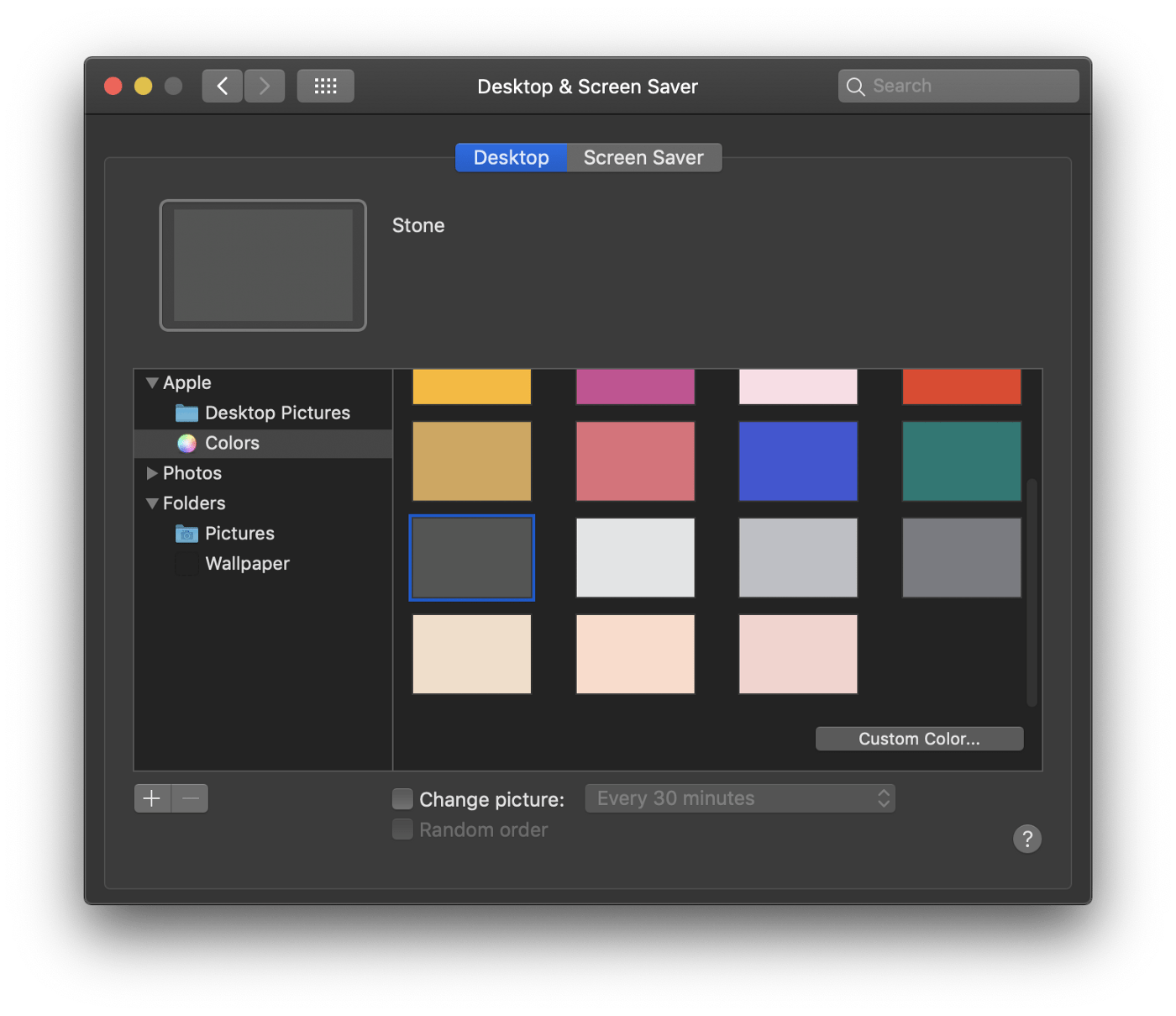
Also, might I recommend the standard issue “Stone” (#545554) wallpaper? I have often attempted to go darker (#222222 to even #000000), but I find the contrast and emptiness this gray affords unparalleled.
Finder Titles
When I first made the switch to Apple stuff (around the time of Snow Leopard) I often felt quite lost as to “where I was” on the hard drive. I found this handy command to replace the Finder title with the absolute path of the current directory. Just open Terminal, paste this in, and press Return:
defaults write com.apple.finder _FXShowPosixPathInTitle -bool true; killall Finder
Now instead of Desktop I see /Users/tetters/Desktop.
Toolbar & Navigation
Another quirk about macOS: navigating to the parent directory via the UI is not incredibly intuitive — and in the case of some shortcuts and events — actually impossible. To address this I added the “Path” item to the toolbar and removed everything else but “Search” and “Back/Forward”. You can also right click on the title bar to navigate to parent directories, but I always forget about that.
The “Path” toolbar item.
Getting used to ⌘+Shift+G is crucial as well. Pressing these keys opens the “Go to the folder:” dialog box. Note this works with “tab” autocompletes, so you can start typing the name of a director, press Tab and it will automatically fill out the rest for you.
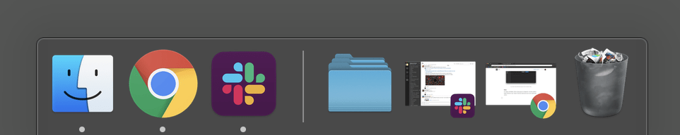
Dock
It’s empty and hidden. Only running apps are displayed. I recently added a Finder shortcut to a frequented directory and am not sure I am comfortable with it. I’m always experimenting…
Directory Structure
This one is sorta boring but worth mentioning briefly.
I try to keep my directory structure shallow and wide. In relying on verbose, descriptive names for files instead of their relative locations, I create a sort of redundancy. For example, I might name a file: Acme Co — Design & Development Proposal 2019 — Highland Solutions.pdf instead of placing a file named Design & Development Proposal 2019.pdf in an Acme Co directory.
The difference is subtle but remarkable: if you don’t do it this way, you’ll end up with 500 files named Design & Development Proposal 2019.pdf on your computer!
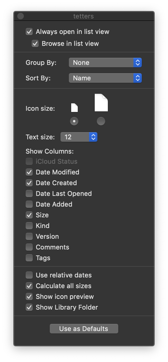
Date & Time
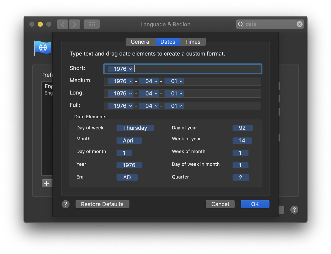
I only use list view. Dates and times are displayed dynamically based on how wide the column is. The irregularities of the stock behavior always felt somewhat random to me, so I just simplify and normalize them all.

Conclusion
- Reduce distractions.
- Increase clarity.
- Increase mobility.
There’s a bunch of other innumerable tiny things I’ve done, but these are the big ones. What are some of your favorites?
