


Unoptimized images on the web have long been one the largest factors in slowing down websites. At the same time, screen resolutions have become denser and have made larger images more desirable.
Fortunately, the technology to fix this problem has long been in development, but unfortunately, not many developers implement it. There is good reason for this; responsive web images is a nuanced and complex topic that is not well documented. But it’s important, and so— after much research and experimentation— I have documented a solution that can be used confidently in most cases.
What we want to do
When serving images on the web, I want the following:
- I want my markup to provide the browser with various image files at different sizes, and for the browser to be able to choose the image file that it thinks is best (based on device resolution, file size, internet connection speed, etc.).
- I want to use modern formats (WebP, JPEG XR, JPEG 2000) to deliver images faster, but also include fallbacks to JPG, PNG and GIF.
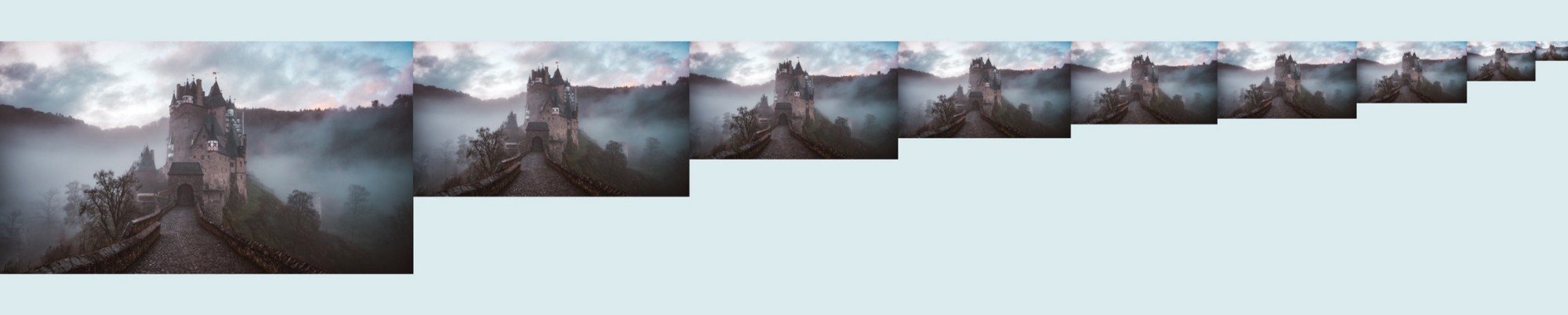
- I’m assuming a purely responsive image scenario. This means that it is one image at different size, with no differences in art direction or cropping (Note: that would be an adaptive image, which is something I hope to cover in the future.)
Seems simple, right? Well, it almost is, but there’s the thing...
Browsers just won’t agree with each other
I wish I could get straight to the code, but it’s important to talk about image formats because these inform the code significantly.
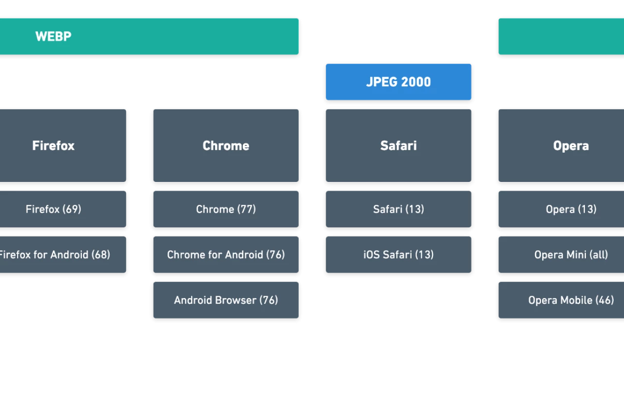
The three “modern formats” in contention right now are WebP, JPEG2000 and JPEG XR. Here’s what you need to know:
WebP — file extension is .webp. The thing that makes WebP cool is that besides compressing images well, it also supports transparency and animation. An open-source format by Google, it has been adopted by all the big players except Safari (I’ll let you guess why).
JPEG XR—file extensions include .jxr, .hdp and .wdp. Originally developed by Microsoft, it has since been adopted by the Joint Photographic Experts Group (the folks who brought you JPG) as one of their standards. It supports transparency, but not animation. It has been supported by IE since IE9, but no other major player has adopted it.
JPEG 2000—file extensions include .jp2, .j2k, .jpf, .jpx and .jpm (there are differences between these, but I couldn’t tell you what they are.) It’s called “2000” because it was developed around that year by the Joint Photographic Experts Group. It also supports transparency, but not animation. Safari and iOS Safari are the only major browsers to use this format.
What I decided about image formats
Based on the info above, I’ve decided that the only modern format I want to use is WebP. My reasoning:
- It is the only format to support animation, which makes it a reliable replacement for JPG, PNG, and GIF. Though animated GIFs are a less common filetype than PNG and JPG, I’ve run into enough scenarios over the years to always plan to support them.
- WebP seems to have the best compression/quality tradeoffs. This is a bit subjective, so see for yourself using this cool tool. But in most cases, it feels good to me.
- The only browsers that will suffer are Safari and iOS Safari, and I’m willing to play hardball with Apple in a way that they play hardball with everyone else: I don’t believe JPEG 2000 is the future, so I’m just not going to support it in the products I build (this is exactly what Steve Jobs did with Flash).
This will probably be a contentious decision and you can fight me later, but right now I’m going to (fiiiiinallly) move on to the code.
Browser Logic
Here’s the thought process the browser has when it sees this code:
- <picture> : Great! It’s going to be a picture. Yay!
- <source> : Let’s check out this element and see if I can display it.
- srcset= : Wow, this is a lot of images to choose from. It’s good to have options! But I’m still not sure which one to show.
- sizes= : This is great information. It tells me what size the image is going to be displayed in the different viewport widths. I’m feeling really good, but I still need some more info.
IF | Most Browsers:
5. type= : This is in .webp format which is a small and crunchy filesize. I am so happy right now.
6. Everything looks good! Now let me check my window size and compare it to the values insizes, ask the device for its resolution, network connection speed, and whether it’s in data saving mode. I’ll do some maths on all that information, which will tell me which image from srcset I want to show.
7. <img> : Let me jump down to this element and grab values from alt, class and any other attributes so that I know everything that you, oh wise developer, would like me to do. I’ll apply all of those things to the WebP image file I chose.
8. Abracadabra! We’re done. Here’s your image! 🙂
ELSE IF | Safari, iOS Safari
5. type= : Whooaaa hold on there. This is in .webp format…that was Google’s idea. 🙅♂
6. <img> : This I can do. Let me analyze srcset= and sizes= just like the other browser did above — only better because I’m an Apple product.
7. srset= and sizes=: Great! A ton of image files to choose from. I’m going to check out all the attributes just like the other browser did above. (Just don’t forget I do it better!)
8. Appleisthemostprofitablecompanyintheworld! Did I just say that out loud? I meant we’re done. Here’s your image! 😄 (And here’s a sticker: 🍎)
ELSE | Old browsers, edge cases:
(In this case, we have to start from the beginning)
- <picture> : Uhhhh. I dunno. Maybe there’s something in here though.
- <source> : I don’t understand. Ignored. 😕
- <img> : I remember this one! 😬
- srcset= : Is this even HTML? 😨
- sizes= : THIS ISN’T HTML!!! 😭
- src : Phew! Okay, I got this. Here’s ur thing. 😅
The Code— Elements and Formatting
Let’s talk about formatting. Specifically, the elements and attributes some of you will be less familiar with.
<PICTURE>
A generic container that tells the browser “Hey! There’s a picture in here.”
<SOURCE>
Kinda like <img>, but a lot more flexible. The most important thing to note is that it MUST come before the <img> tag. The browser checks elements in order, so displaying <source> after <img> means that <img> will just get displayed and <source> will be completely ignored (and we still need <img> because older browsers won’t recognize <source>).
SRCSET=
The goal of srcset is to tell the browser what images we have available, and what size those images are. The formatting was created this way so that the browser doesn’t have to fetch the data on its own, which would be a big resource hog.
The formatting itself is pretty simple:
srcset="this-is-the-image@100-pixels-wide.png 100w,
This is an image at 100px wide, and we are telling the browser that. You’ll note that we are using an unusual unit here: w . We use w instead of px in this scenario because it is a unit specifically used to tell the browser the image width of the actual file. You must use this formatting — px will not work.
SIZES=
This is the part where most of us mess up, so let’s go through it carefully.
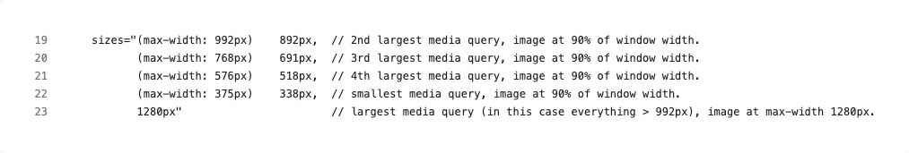
The goal of sizes is to tell the browser what the size an image is displayed at a given breakpoint. If my breakpoint is 768px, and if at that breakpoint the image is 90% of the window width, then my image display size would be 691px. In the code that looks like this:
sizes="(max-width: 996px) 691px, (max-width: 768px) 518px...
You’ll note that the 691px we defined is on the same line as 996px, not the 768px. That’s because our order of operations is a bit funky for sizes. You probably noted that I commented this in the code.
Weird, right? You might be asking “Can’t we just go smallest to largest? That’s a normal way to do media queries.” I had the same question and I experimented with it, but it simply didn’t work. MDN explains that it has something to do with the order of operations and the browser needing to know the first thing that’s true, but my explanation is much simpler:

Creating WebP images
You may be thinking, “This is all fine and dandy, but how do I make those goram WebP images in the first place?”

Glide
Glide is a PHP image manipulation library. If you’re using Laravel 4+, it should be extra-easy (I’ve been using it through Statamic, which is a lovely little CMS built on Laravel.)
NPM
At the time of writing, NPM has a number of WebP converter packages. I haven’t tried it personally, but it’s an obvious solution for something like this.
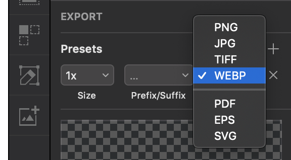
Sketch
If you’re a masochist and want to export images manually then Sketch is your best bet as it is equipped to export WebP by default. It can be done in other programs too, but most of those require plugins or extra steps, so for now, Sketch is probably easiest.
The Future
It took me several weeks and two projects to understand the issue to this point. It was hard to find good resources, and I was about 90% of the way through this writing post when I found Greg Gant’s “Getting started with Webp, JPEG2000 and JPEG-XR”. If you’re interested in understanding file formats further I suggest checking out his work.
That’s it for me. Hopefully this post helps you help the internet be a slightly faster place.
