


It is extremely annoying when your application has many nested forms and you have to click your way through multiple pages just to see the page you’re working on. Once you finally get there, you realize an input is not placed quite right. Then you tweak the form and start over.
Do this enough times and you might feel the urge to create a shortcut hack to get you where you need to go without repeating that annoying sequence one more time. One of my developer buddies did just that, and while it’s an improvement over repeated trips through the GUI to get where you need to be, there’s really a much better way.
Solution: Storybook
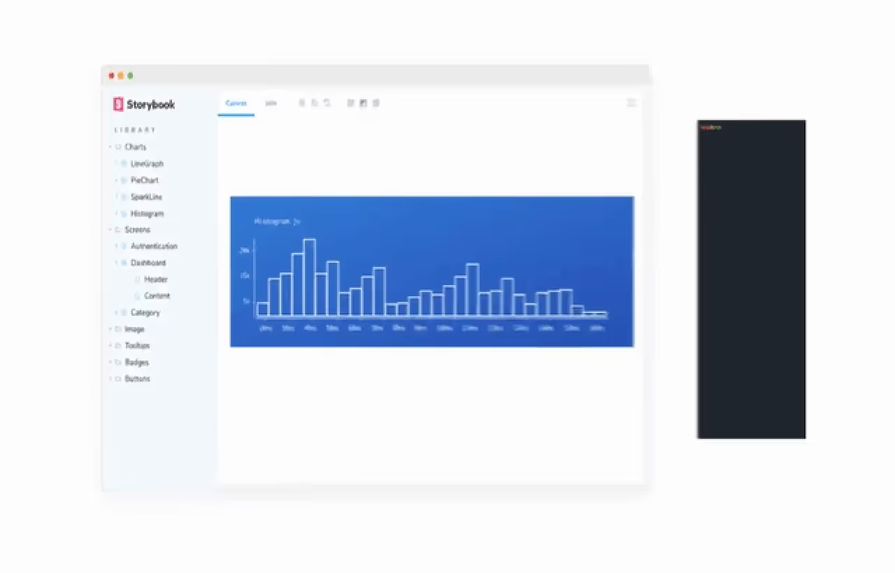
Enter Storybook.js.org, a power toolkit for building and maintaining components. Storybook is all about developing components in isolation. The introduction reads:
Storybook is a tool for UI development. It makes development faster and easier by isolating components. This allows you to work on one component at a time. You can develop entire UIs without needing to start up a complex dev stack, force certain data into your database, or navigate around your application.
Storybook’s workflow enables you to focus precisely on the component or page that you’re currently working on. Your component or page becomes part of a catalog of building blocks that can be developed independently of the application itself.
You get to choose whether to add Storybook to your application or use it completely independent of your application. You can also publish your Storybooks for others to see and experiment with. Your Storybook becomes an interactive playground where you can show off your components and manipulate them to see how they behave in a real application.
Each component can be shown in one or more Stories. They can be shown in complete isolation as well as part of a larger component. A Story can use controls, actions, and other methods to show how a rendered component can be altered via props, events, and other framework-specific mechanisms such as slots for Vue.
A rich variety of Frameworks are supported including React, Vue, Angular, Web Components, and many others.
Building a Storybook for Vue 2
*Note, at the time of this writing Vue 3 core has been released but some supporting libraries do not yet officially support version 3. Storybook is in that camp, and support for version 3 is pending. According to this issue, we may see Vue 3 support in Storybook version 6.2. I’ll post an update when Vue 3 support is available for Storybook.
Below, I’ll walk you through how to build a basic Vue app container, install Storybook in the app, and build a component that uses Vue slots. How to use Vue slots is not well documented at present — I‘ll show you a way to use slots and build a typical Vue SFC (single file component) by re-implementing the example Button component as a Vue SFC.
1. Install Vue CLI
$ yarn global add @vue/cli
2. Create Vue 2 app (preset “default” will create a Vue 2 app in directory sb)
$ vue create -p default sb
3. Install Storybook into app
$ cd sb
$ npx sb init
4. Start Storybook
$ yarn
$ yarn storybook
Storybook will start and open a new window on your browser. You should now see Storybook, probably serving on http://localhost:6006/, and looking something like this:
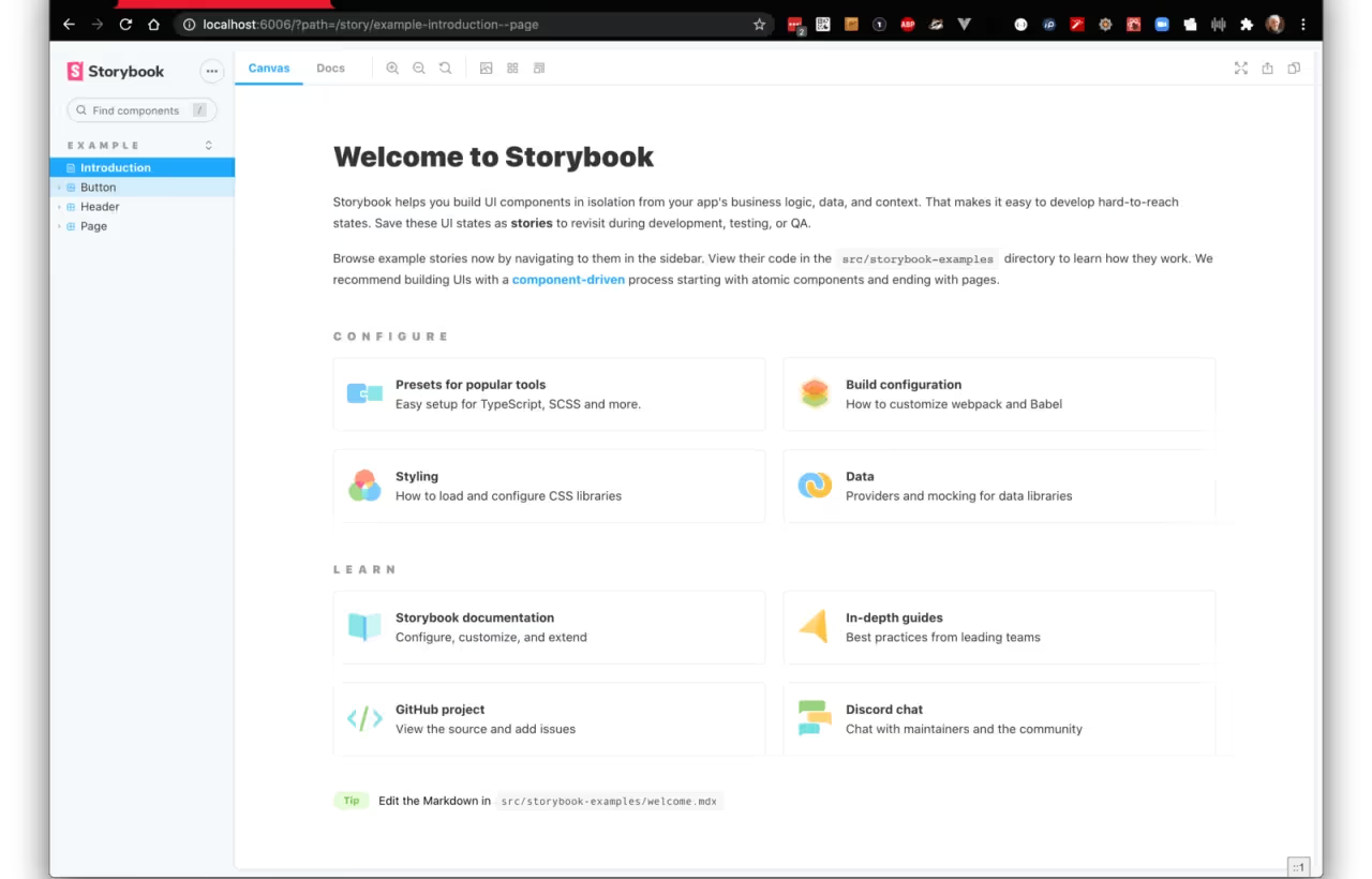
Notice on the left sidebar menu links to “Introduction” and three components named “Button,” “Header,” and “Page.”
- The Introduction page also has links to other Storybook resources.
- The Button link shows four variants of the Button component.
- The Header and Page components make use of the Button component.
This shows how you can begin to build complex components that use lower-level components like the Button component.
Building a Vue Single File Component
Vue components are often created using the Vue SFC style where the component template, javascript, and styling are all contained in a single file. This is not a requirement, but it is a convenient way to package everything a component needs in a single file. Vue components also often use the slot facility to allow a parent component to inject data for display into the child component. Props are another way to inject data but slots are generally preferred by Vue developers. Slots also provide other features, such as named slots for injecting data in multiple places, default content that will be used but which the parent can optionally override, and dynamic content that can change at runtime.
We will build VButton.vue, a modified version of Button.vue, and then convert the prop named “label” to a slot named “label.” Along the way, we will see how Storybook handles props and slots and makes them into ‘controls’ that allow a user to tweak the rendered component.
A review how to inject the button label from the component’s parent.
The prop way of injecting the button text looks like this.
<VButton label="Submit" />
The slot way of injecting the button text looks like this.
<VButton v-slot:label>Submit</Button>
Both props and slots are effective for this purpose and the developer can use either when developing a Vue component.
Using Props in a Vue component
Storybook has really nice support for props. Here is a snippet from the original Button.vue component using props to inject the label. Note the prop “label” is required and of type String. It is rendered in the component by surrounding “label” with curly braces.
Here is a snippet from Button.stories.js that renders the Button.vue component.
Note the props “backgroundColor” and “size” are declared in the argTypes object and the props “primary” and “label” are declared in the template “Primary” in the args object. This is an idiomatic Storybook and simplifies setting up variations of a rendered component to display and tweak the variants at runtime. All four items are props but the ones declared in “argTypes” are “controls” on props while the ones declared in “args” are simply props.
Note that the prop “label” declared in Primary.args is a simple prop with value of “Button.” Think of items in args as props/slots/actions and items in argTypes as describing the behavior of args items. This is indeed how we specify a control on an arg. The control might be a select list, color picker, text input, etc. Note that some controls can be inferred by Storybook directly from the component. Notice the radio button for “primary” that can either be True or False, depicted in the screenshot below. The prop “primary” is a Boolean and Storybook can infer that a radio button is sufficient for this prop control.
For more on args and argTypes see the docs.
Button in Storybook.
Note that all the props can be tweaked live.
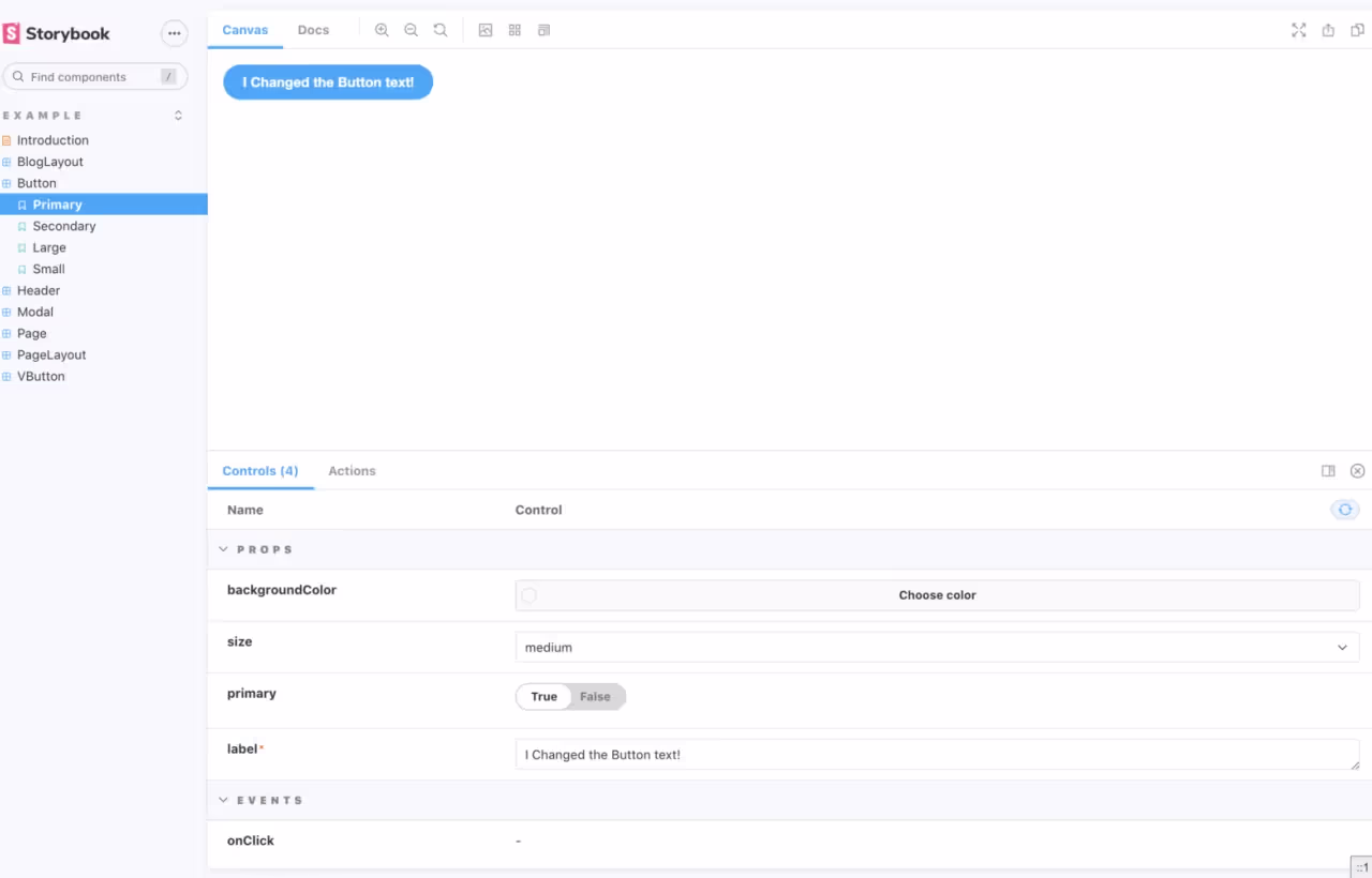
Note that the default label of “Button” has been tweaked in the label prop control to say “I Changed the Button text!” Also note that expanding the “Button” on the left menu shows 4 variants: Primary, Secondary, Large, and Small with Primary selected. The tab “Canvas” is highlighted. For reference, selecting the tab “Docs” will show all the variants on a single page. This is really convenient to see a catalog of variations on a component.
Using slots in a Vue component
Storybook can detect when a component is using slots. It scans the component template and when it sees “<slot>…</slot>” with or without a name qualifier, it knows that the component is using slots. Storybook is using vue-docgen-api under the hood to parse the Vue component and determine what slots and props exist.
So, how do we specify the slot argument to Storybook? Let’s rewrite the Button component using slots and see how it’s done.
VButton component snippet based on the Button component.
<template><button type="button" :class="classes" @click="onClick" :style="style"><slot name="label">Submit</slot></button></template>
The differences between Button and VButton are minor. Button renders the label from a prop value. VButton renders the label from a <slot> directive. All that remains is how to make the slot value a Storybook control. This appears to be an oversight in the Storybook docs—but fear not! It is indeed possible, and actually quite easy, once you understand how to implement a slot control.
VButton.stories.js snippet that shows how to make a slot control.
This is a bit messy! And we still have to declare a Template and variants. The “label” key specifies a slot named “label” and defines a text control with a default value and description. The “table” section is not really needed but has been added to clean up the “Docs” tab a bit. I added it to the “onClick” action as well for the same reason. So, all we really have is four args consisting of two props, a slot, and an action. Recall that “label” was previously parsed by Storybook to be a slot.
Add a Template and two variants to VButton.stories.js
VButton like this
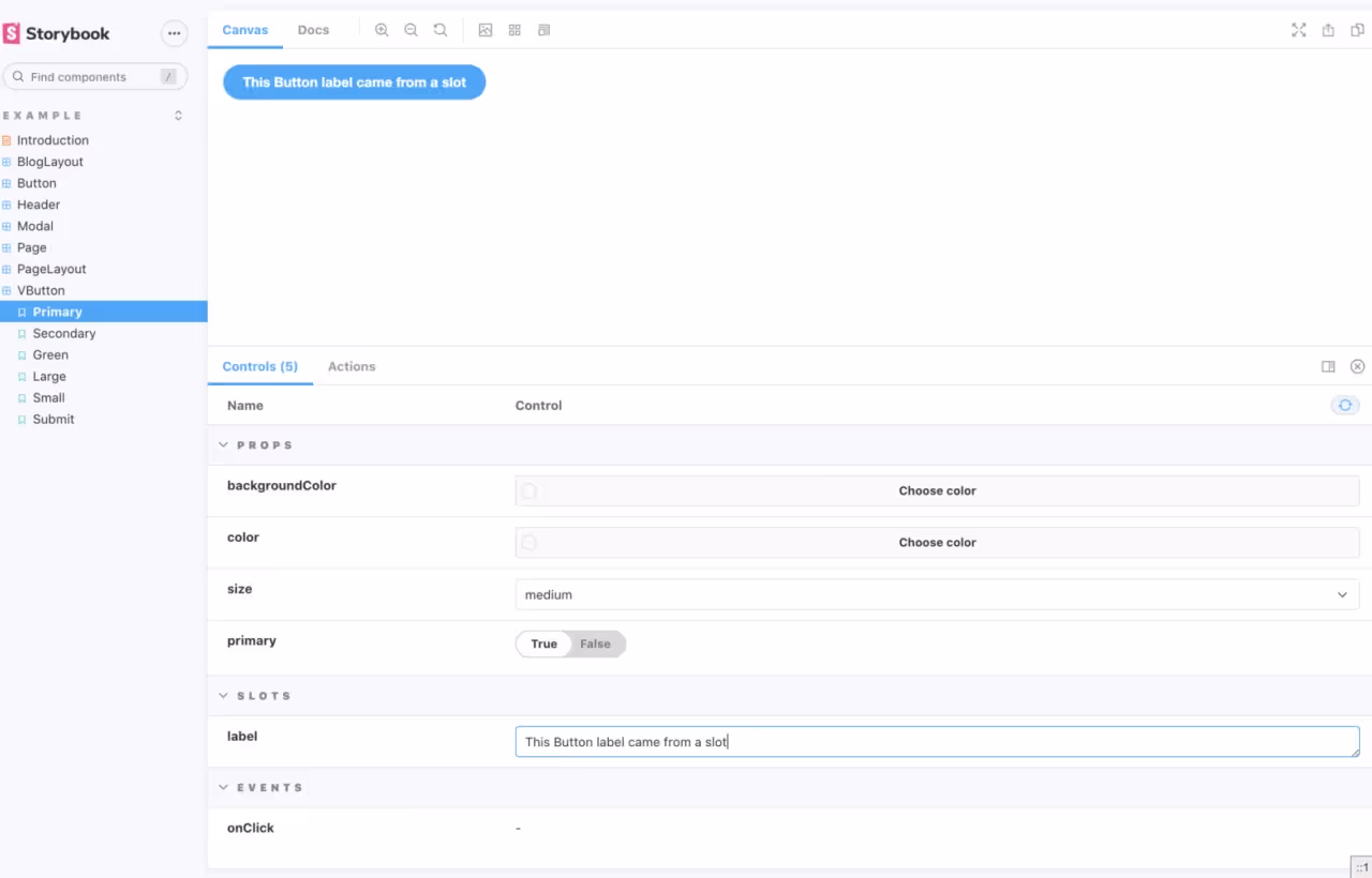
Note the similarity with how Storybook displays the Button component. The only difference is a slot control named label here versus the prop control named label in the previous screenshot.
Complete VButton.vue
VButton.stories.js
There is more to Storybook that I hope you will find valuable. I encourage you to give it a try and see how easy it is to develop your components in isolation from your application. Using slots with Vue components turns out to be quite easy in Storybook.
If you want to learn more in general, see the docs and tutorials at https://storybook.js.org. In addition to all the excellent guides and docs at storybook.js.org there is a sister site https://www.learnstorybook.com/ that “teaches tried-and-true development techniques for UI components. The best practices here are sourced from professional teams, Storybook maintainers, and the awesome community.”
Summary
Developing components in isolation is so much better than embedded in a complex application. Indeed, you don’t need to understand the logic of the application to develop a component that will be used in the application. This allows you to focus precisely on how the component looks and behaves, either by itself or part of a composition of components. On big projects, you can have one team working on components while another is working on the application business logic. You are also developing a catalog of components that can be used for other projects, an investment that will pay future rewards.
Resources and UI Libraries
Find other examples of Storybook in action in the following resources.
- UI framework for eCommerce
- A Material Design inspired UI Library
- A curated list of Storybooks from the Storybook team
